Eric Haller, Secondary Short Term Occasional Teacher, Peel District School Board
rickyhaller@hotmail.com
In many experiments students collect two-variable data, make scatter plots, and then try to find the line of best fit so they can talk about how two variables are related. Microsoft Excel has a built-in function that readily does this. Just enter the data, create a scatter plot, right-click on any piece of data on the graph, and click on the
Add Trendline option. In addition to a straight line of best fit, Excel can also fit exponential, power, logarithmic, and polynomial-type curves. The graph below shows some examples of what Excel can do with the
Add Trendline feature.
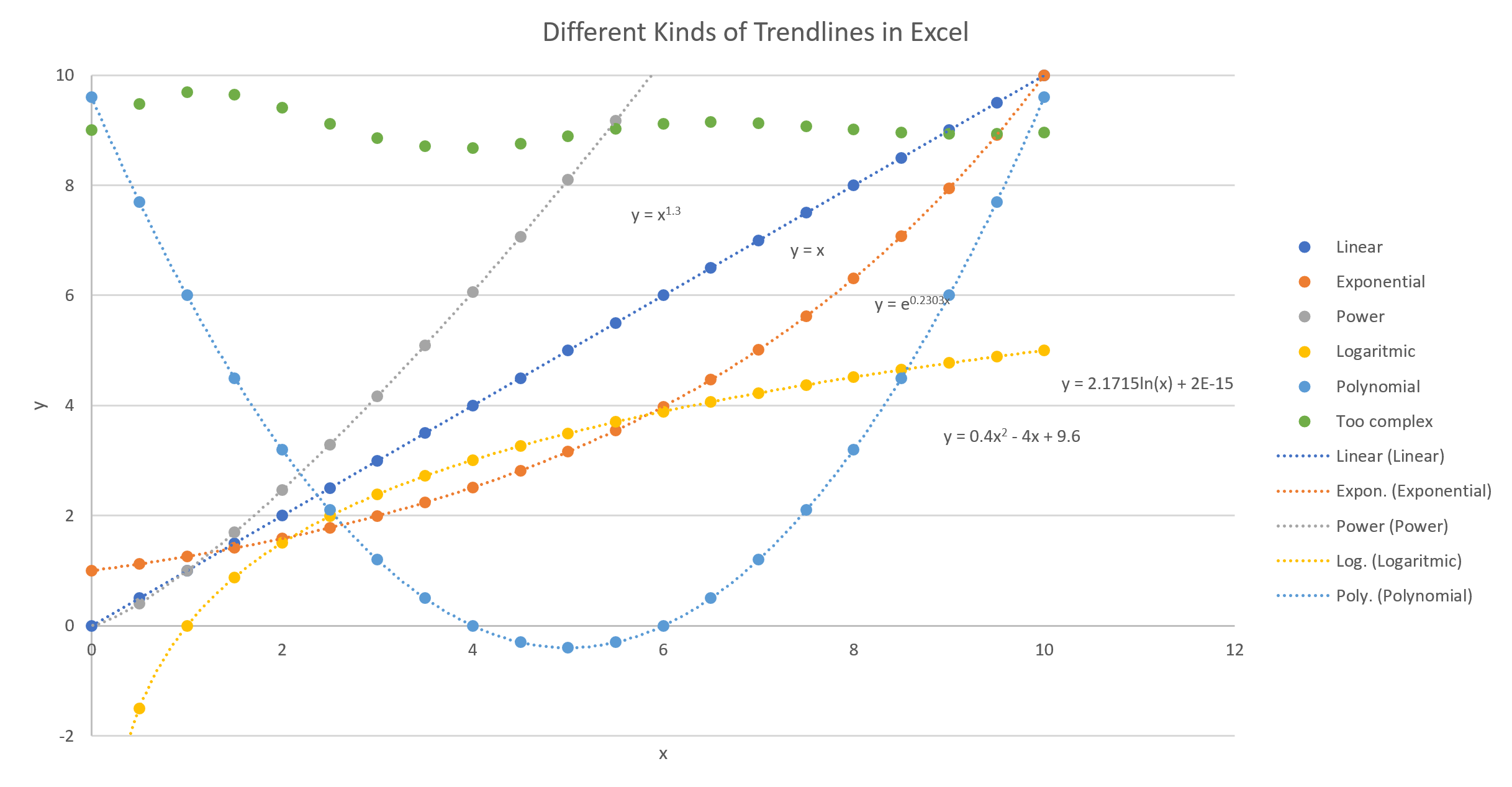
Did you notice the green dots don’t have a fitted curve running through them? That data is too complex for the Add Trendline feature; but Excel does have another feature you can use to fit curves to data. The rest of this article sets out to explain how to use it for yourself.
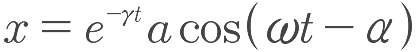
The need to analyze and fit complex data like those green dots arises with the dampened harmonic oscillator, which is encountered in grade 12 university level physics. For example, the amplitude of swing of a pendulum experiencing friction can be described by the following equation.
 http://hyperphysics.phy-astr.gsu.edu/hbase/oscda.html
In second-year of university in classical mechanics, you may have encountered a projectile, with air resistance, which has a trajectory described by the following equation.
 http://mistersyracuse.com/uploads/3/0/8/0/3080275/projectile_motion_with_air_resistance.pdf
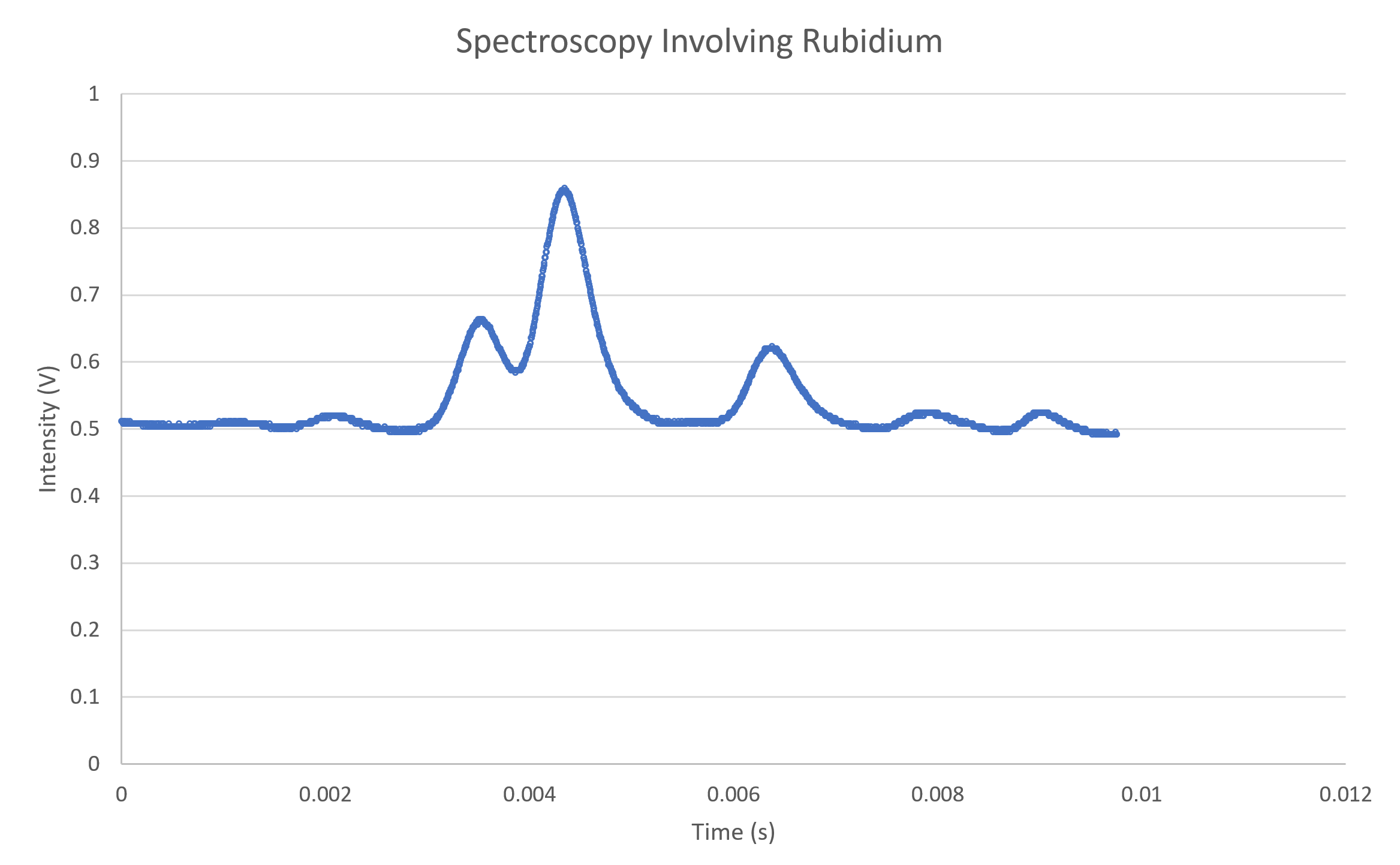
Also, if you have ever studied spectroscopy, you may have done labs involving complex curves that ended up looking something like this.
 The Least-Squares Technique
What if you have done an experiment and collected data that is too complex for Excel’s
Add Trendline feature? You can do a
least-squares fit!
Below is a graph with three blue data points. A straight line has been drawn through the data; however, that line might not provide the best fit for the data. To find the line of best fit, we draw straight lines, shown in orange, vertically up or down from each point until they intersect the line of fit (often referred to as
residuals). Then we construct squares from each of those lines.
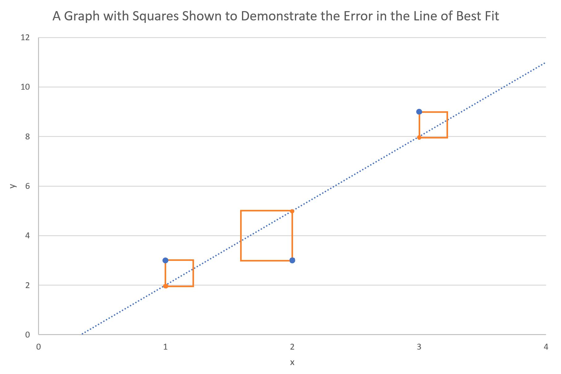
Now think of the areas of those squares as a measure of how far away the line is from where it ought to be. If you add up the areas of all those squares, then you would get a number which represents how far the fitted line is from all the data points. The smaller that sum, the better, which is why the method is referred to as the
least-squares fit.
Excel does a least-squares fit automatically when you click the Add Trendline option, but for complex data, you’ll need to know how to do this in Excel manually. For simplicity, we’ll start by trying to do a least-squares fit on data that happens to be linear, and then we’ll try a more complex fit afterwards. If you’re reading this on your phone, go get your computer, and follow along! If you’re on your computer, open a new, blank Excel document. Copy the following data table and paste it into the cells A1 through B12.
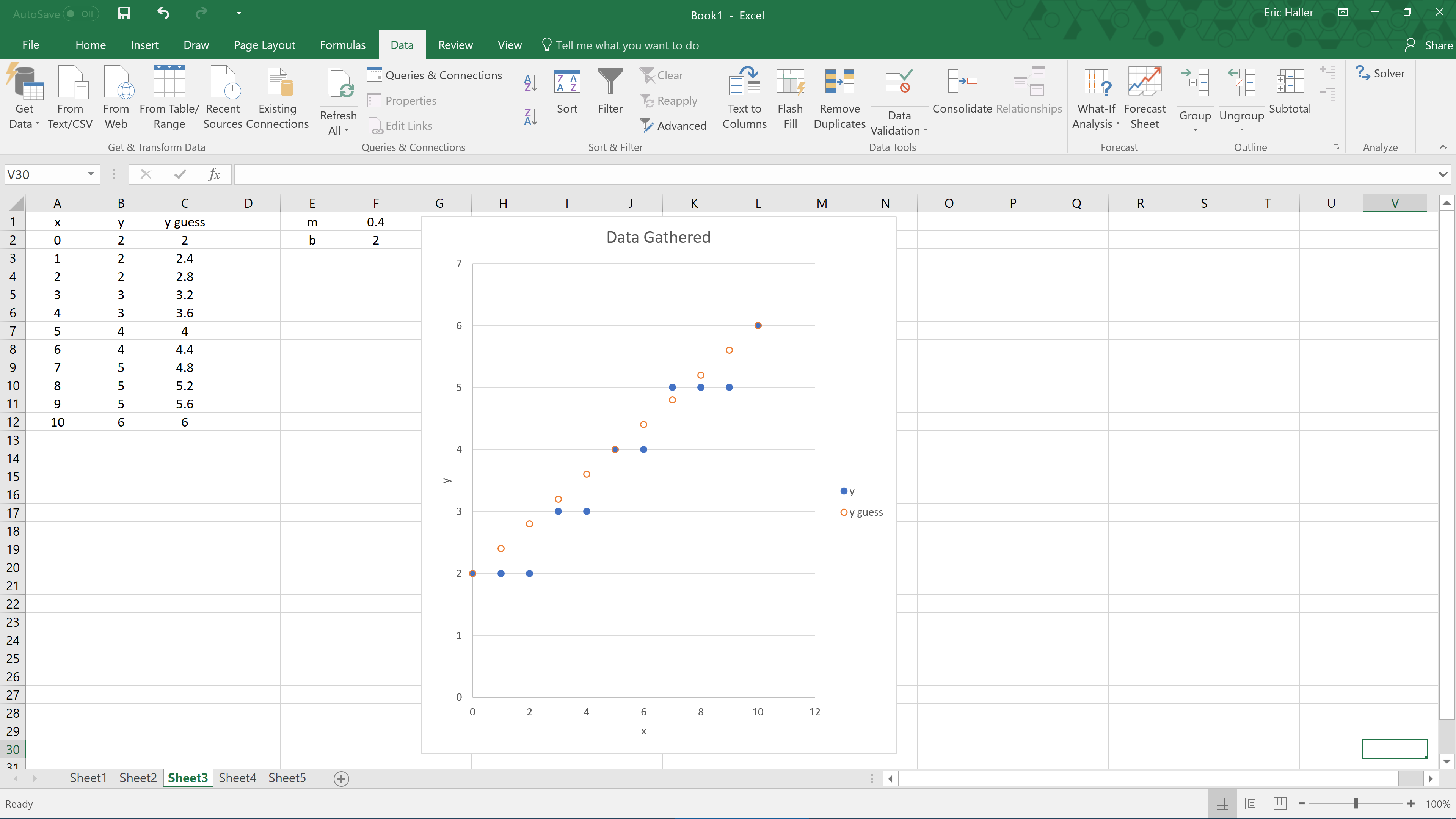
If, when you pasted the data into Excel, you encountered some formatting issues, try pressing the Ctrl+Alt+V keys all at once instead of just Ctrl+V to paste without keeping the formatting. Select the data. Then click on the Insert tab at the top of Excel and insert a scatter plot of the data into your spreadsheet. After labelling the axes and inserting a legend, it should look something like this.
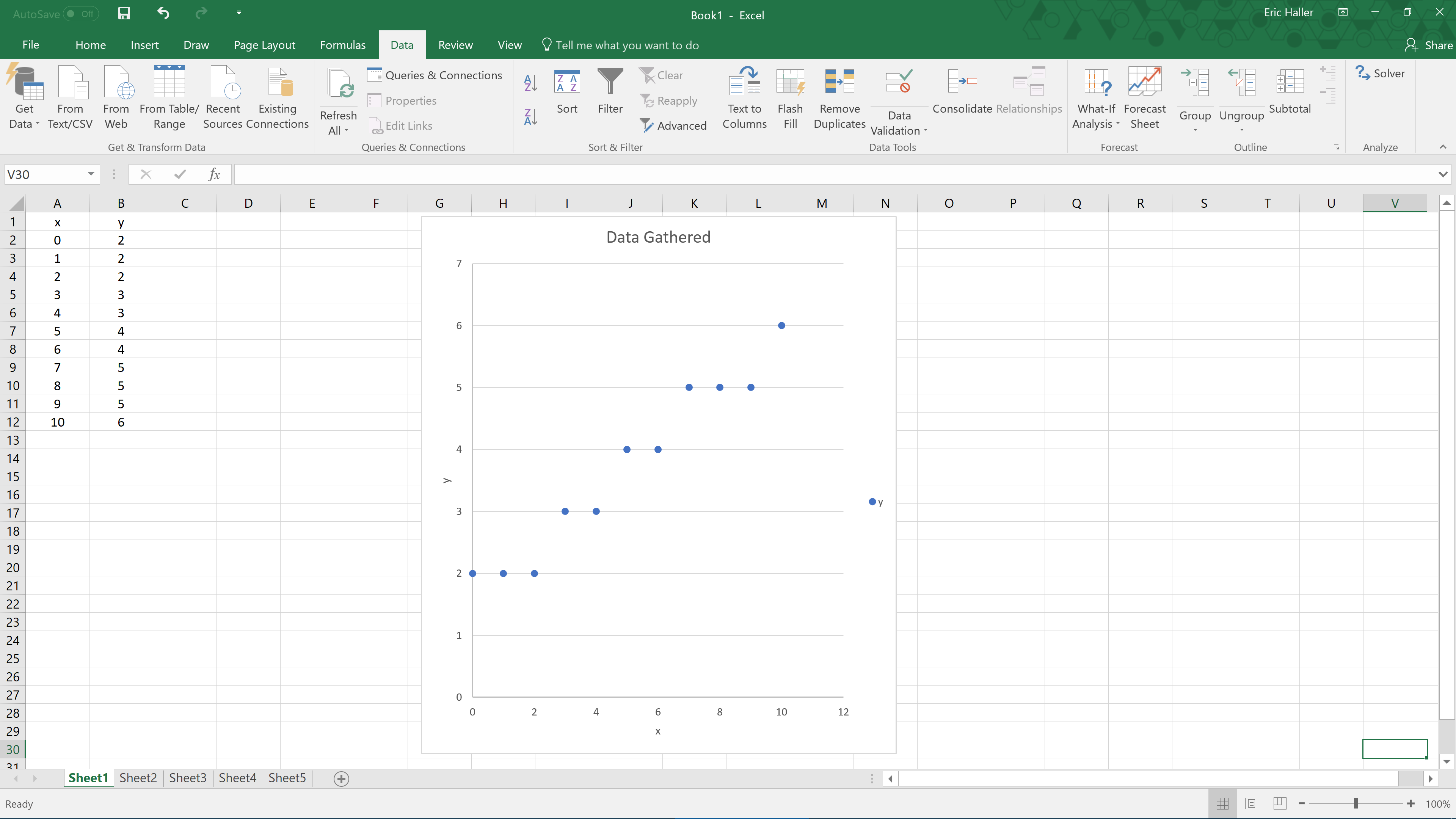
This graph looks like a linear fit could describe it reasonably well. By visual inspection, the line might have a y-intercept of about 2, and a slope close to 0.5. We’ll call that our ‘guess function’, that is,
y =
mx +
b, where
m = 0.5, and
b = 2. What we need to do now is plot that guess function onto the same scatter plot as before. We’ll need to use the
x-values from the original data, substituting them into the guess function to generate the approximate
y-values, which should be close to those from the original data in the table. In cell E1, put the label ‘m’; in cell F1, put the guess value of ‘0.5’; in cell E2, put the label ‘b’; and in cell F2, put the guess value ‘2’. Now to graph our guess function, label cell C1 ‘y guess’, and in cell C2, write ‘=$F$1*A2+$F$2’, followed by the Enter key on your keyboard. After you have pressed the Enter key, the value should change to ‘2’, which is the value of our guess function, evaluated at the first
x-value,
x = 0. With cell C2 selected, you should see a small square in the bottom right hand corner of that cell. Drag that small square down to apply the calculation to the whole column.
Next, we should graph the guessed y-values onto the same graph as before. To do this, right-click on any data point in the original scatter plot, and then click on Select Data. Press the Add button, and for the Series Name, select cell C1; for the Series X Values, select cells A2 to A12 by selecting them with your mouse; and for the Series Y Values, select cells C2 to C12; then click on Ok. The Excel document should now look like this.
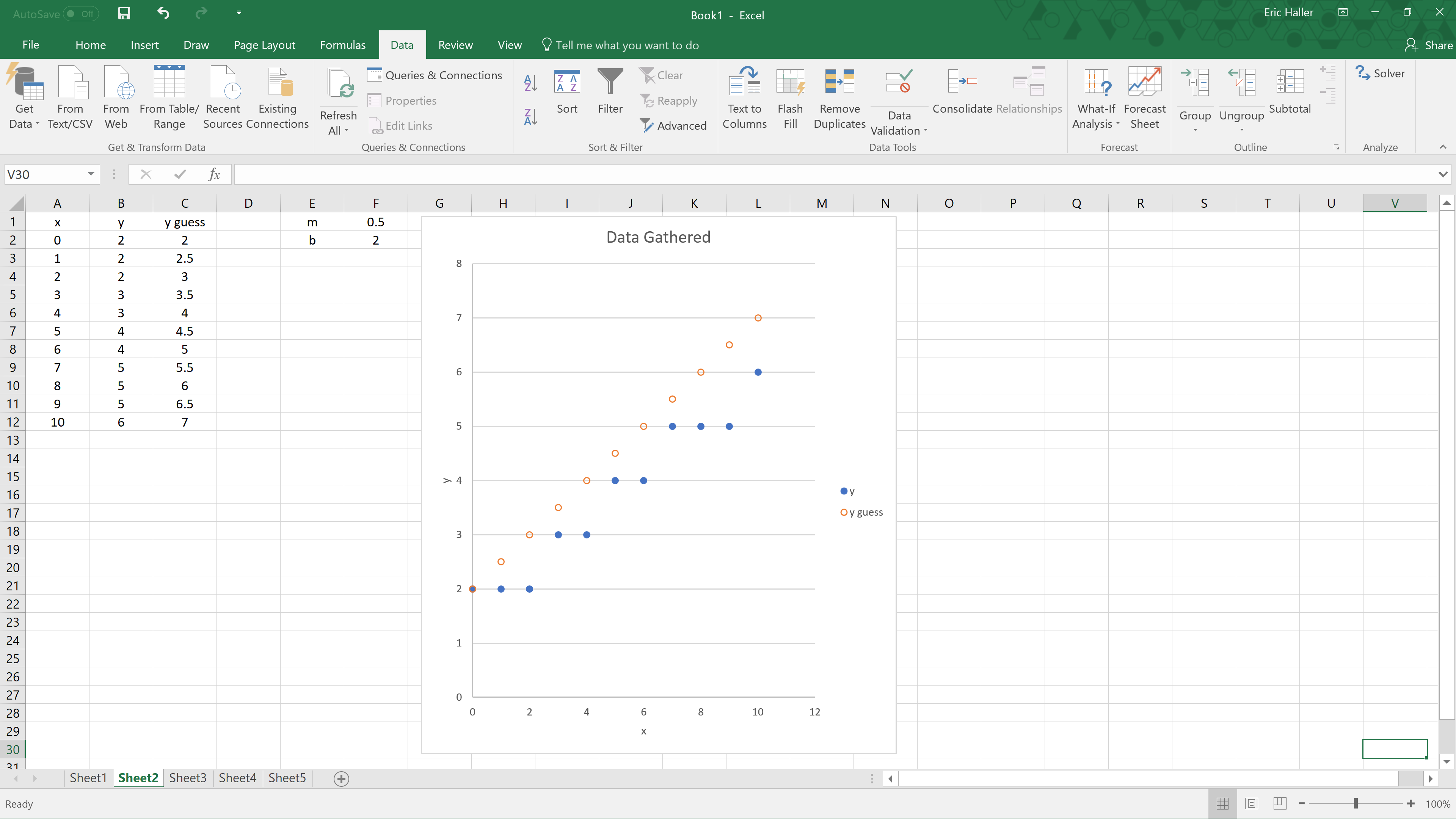
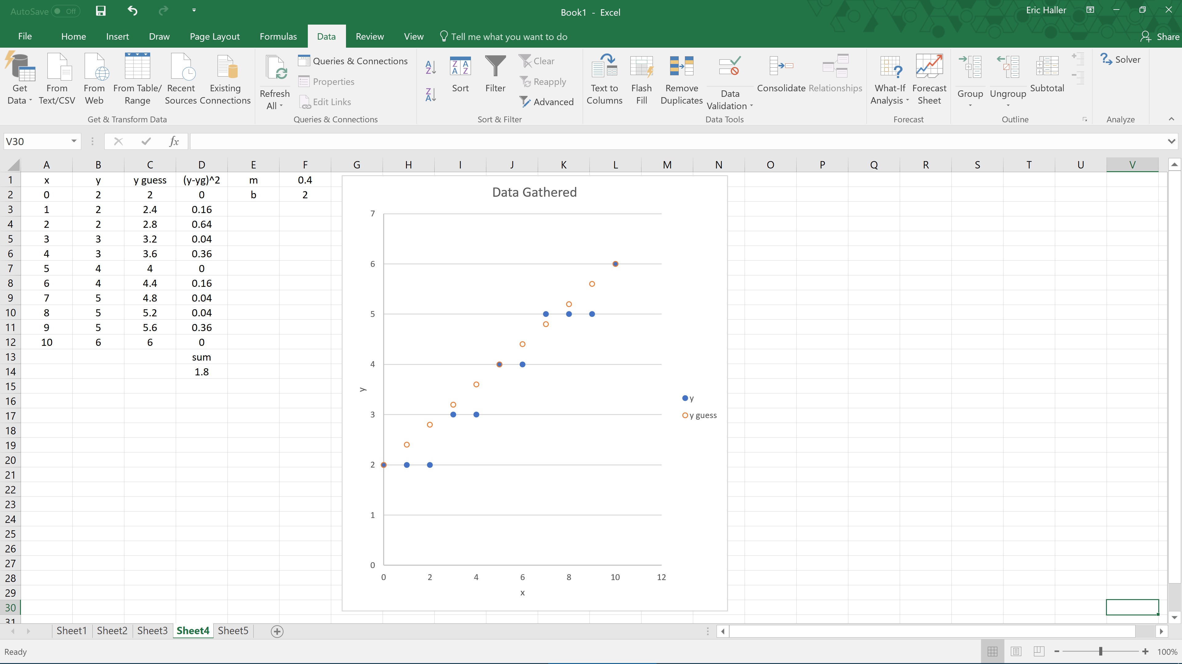
You can see from the graph that the guessed function could be improved by decreasing the slope a little. This is easy to fix, just change the value in the cell F1 from ‘0.5’ to ‘0.4’. Everything will change automatically, and the graph that we guessed earlier should fit the data better now, as shown below.
To do a least-squares fit we’ll need to calculate the square of the distance between each of the original y-values and the appropriate guessed y-values. Label cell D1 as ‘(y-yg)^2’, and in cell D2, write ‘=(B2-C2)^2’, followed by the Enter key. Again, click and drag the small square downwards to quickly do this for every x-value. Then we’ll sum the squares to get a measure of how good or bad our guess was at fitting the data points. To do that, label cell D13 as ‘sum’, and in cell D14, write ‘=SUM(D2:D12)’, followed by the Enter key. Now our Excel document looks like this.
 The Solver Add-in
The value of cell D14, which is 1.8, is the sum of the squares of the vertical distances between each data point, and its respective guessed data point. That value will need to be minimized to get the least-squares line of best fit. This can be done by varying the values of m and b. You could try adjusting the values of m and b repeatedly, trying to make the sum the smallest, but Excel can do this for you via the Solver add-in. If you’re running Windows and Excel 2010 or later, you can turn Solver on by following these steps.
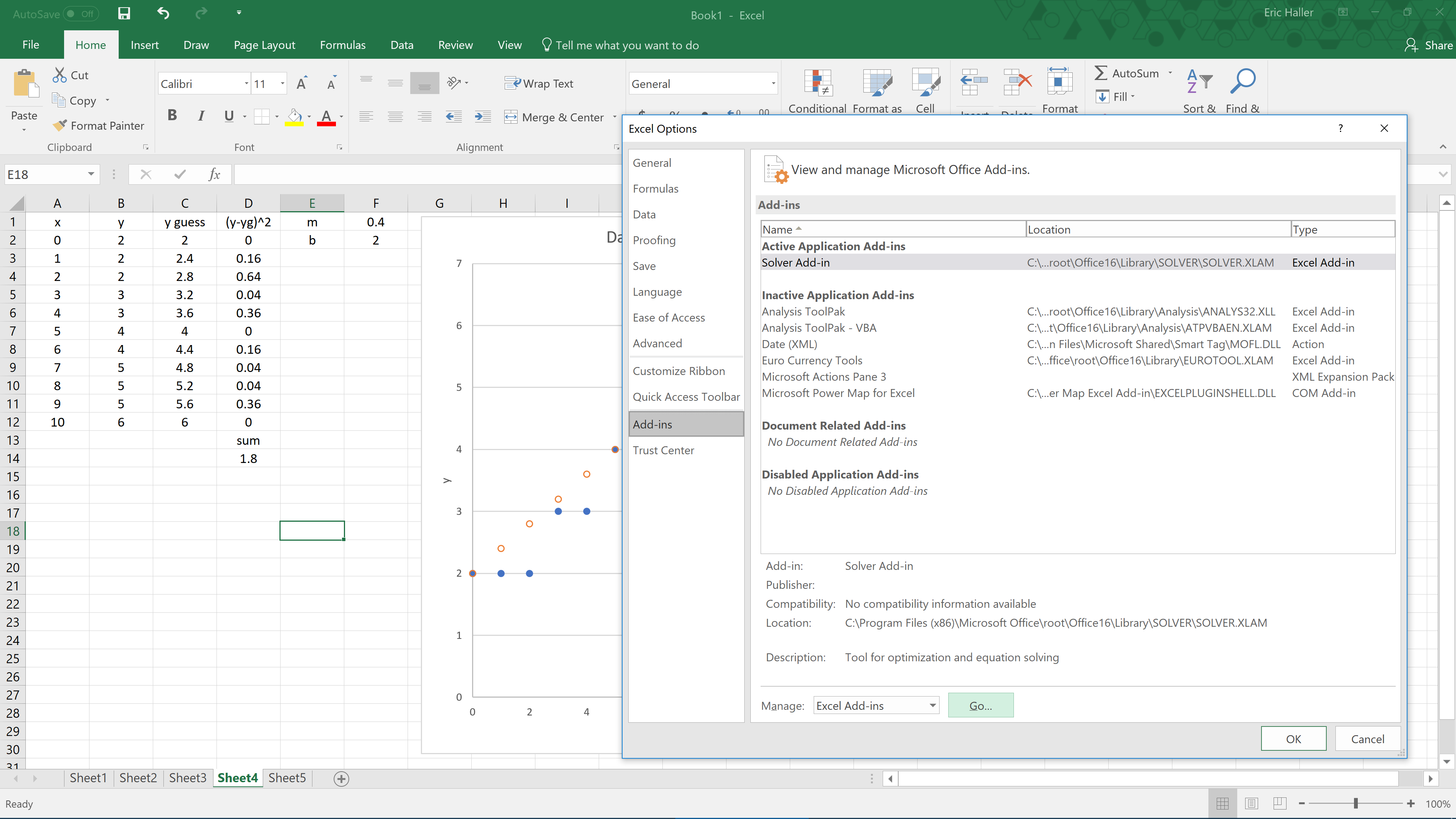
- Click on the File button in the top left, then press Options at the bottom left
- In the pop-up window, click on the Add-ins tab, and where the at the bottom it says Manage: Excel Add-ins, press the GoÖ button (do not press the Ok button)
- In the next pop-up window, check the Solver Add-in checkbox, and hit Ok
If you’re having trouble activating Solver, try watching this demonstration:
If you’re using an older version of Excel, or are not using Windows, then you may need to enable Solver in a slightly different way. Try a Google search on how to enable Solver in Excel. The Solver add-in is on both Windows and Macs with Excel, and has been for many years, so not matter what version of Excel you have, Solver should be present.
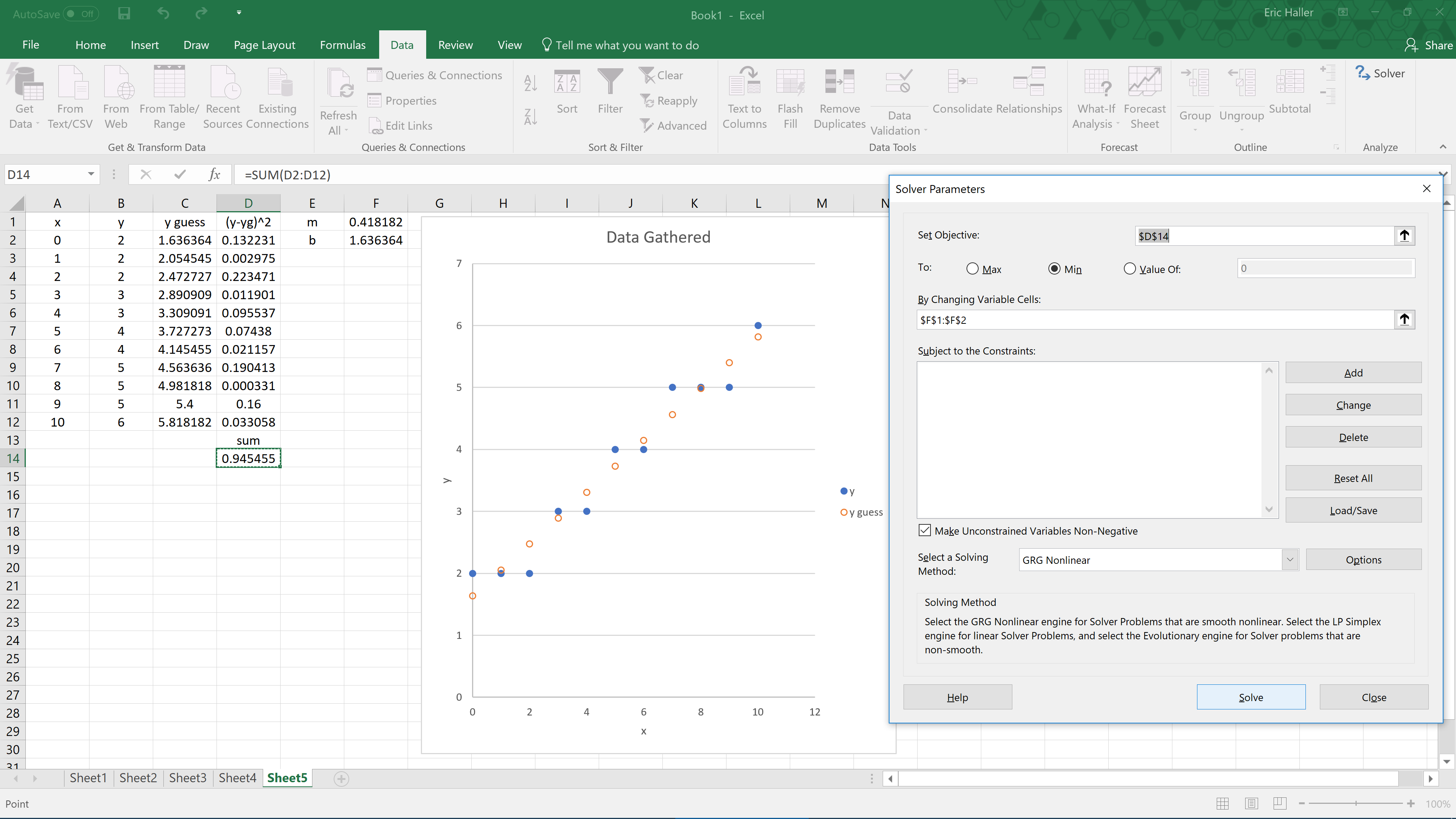
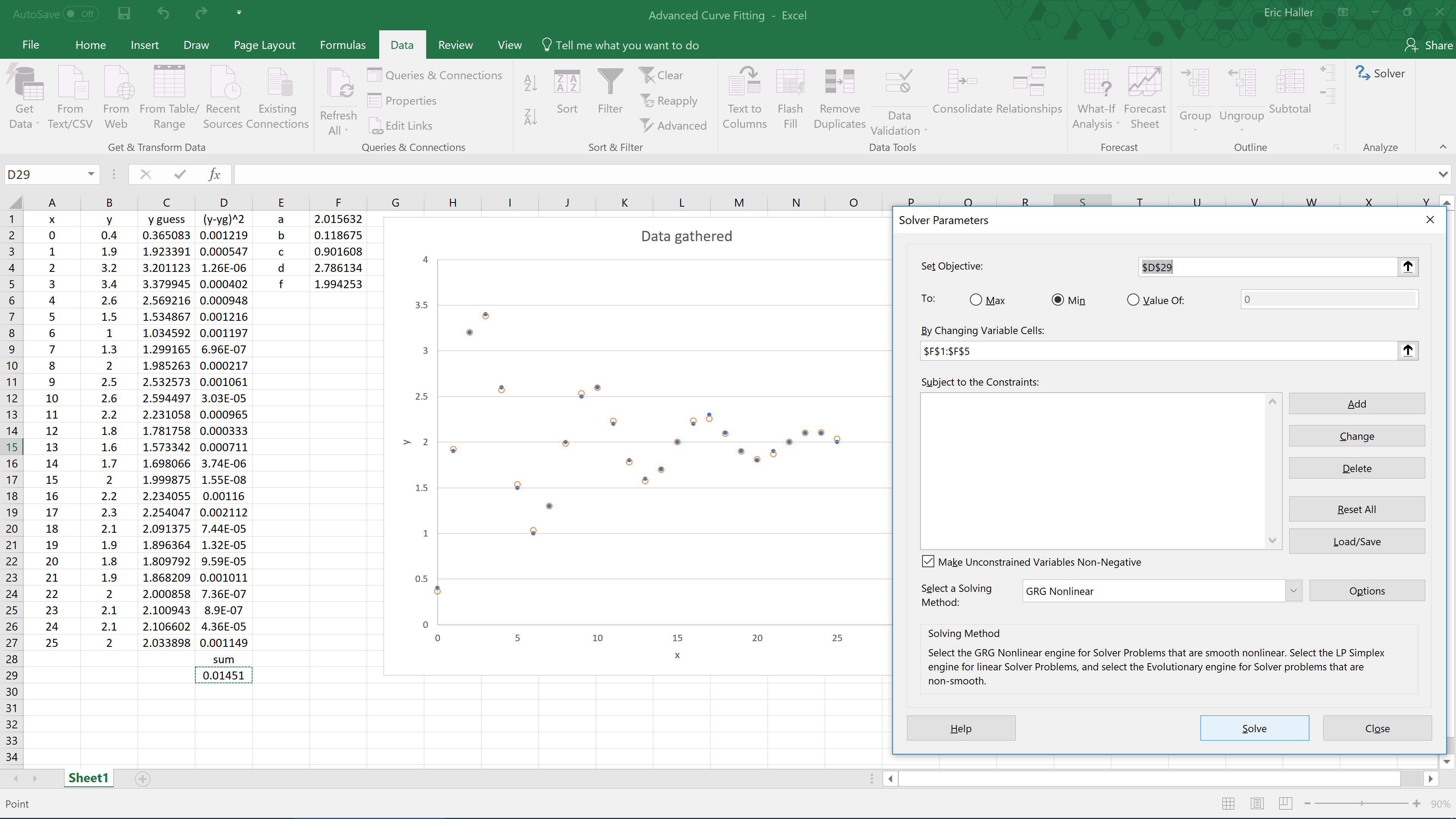
Once the Solver Add-in is enabled, you can access it after selecting the Data tab (to the right of the File tab from before). Under the Data tab, click on Solver, found within the Analyze heading. A new pop-up window will appear. What you want Excel to do here is to minimize the sum of the squares, by altering the values of m and b from earlier. Set ‘Objective’ to ‘$D$14’, set ‘To’ to ‘Min’, set ‘By Changing Variable Cells’ to ‘$F$1:$F$2’, then press the Solve button. You may have noticed a checkbox which allows for negative variables, for now don’t worry about that because our y-intercept and slope are both positive. After clicking on the Solve button, you should notice the values of
m and
b have changed, now
m = 0.418181796, and
b = 1.636363511, which decreases the sum of the squares from 1.8 to a much lower value of 0.945454545. Also, the scatter plot will look like it fits the data better now.
Now that you have finished your first least-squares fit in Excel, let’s try and tackle that damped harmonic oscillator that was mentioned before. We’ll use an equation of this form to describe it.
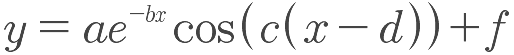 a
a,
b,
c,
d, and
f are the coefficients that need to be optimised to minimize the sum of the squares. x and y are the variables measured in experiment. Let’s start by making a new Excel document, and copying this table into it.
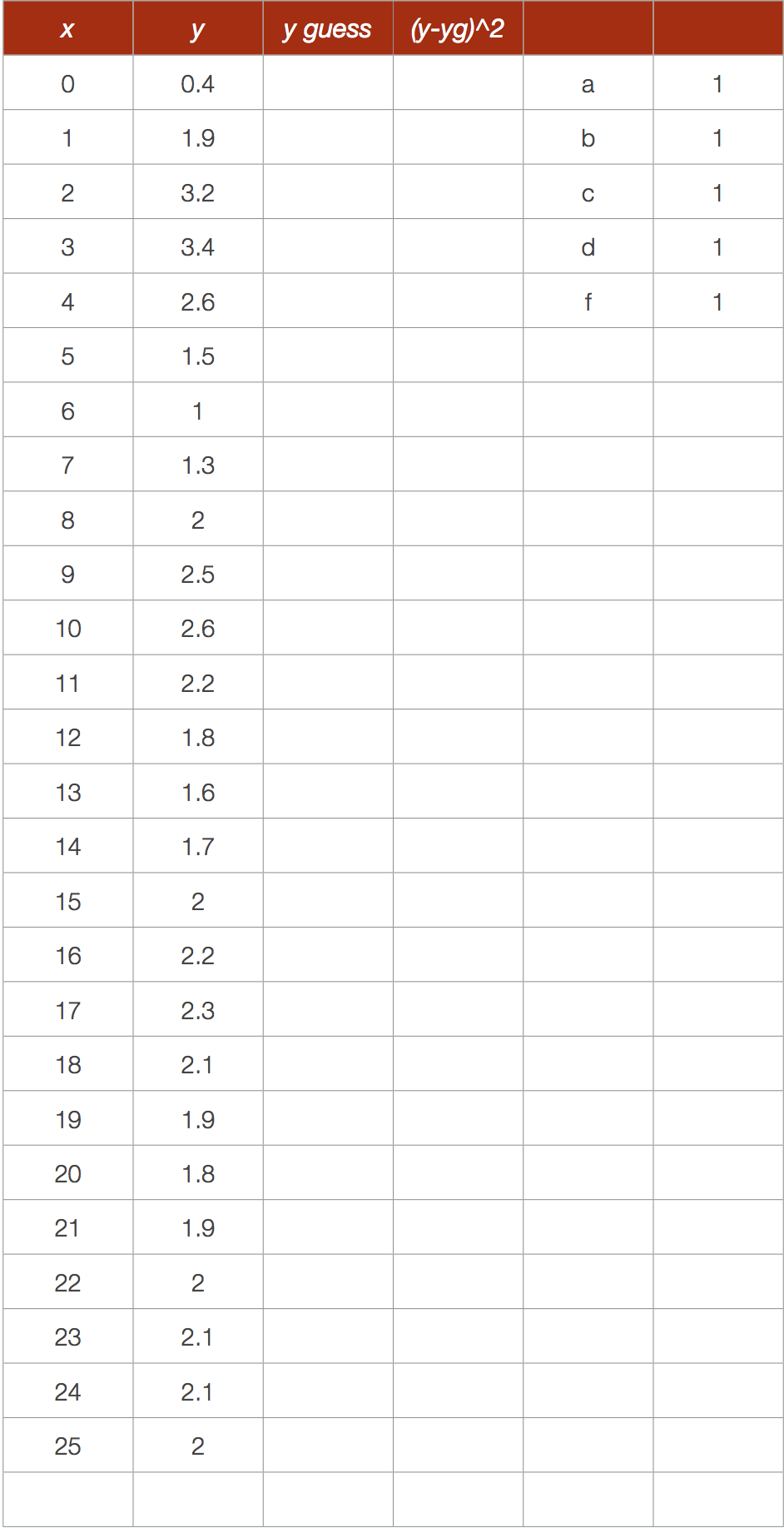
We have initially guessed
a =
b =
c =
d =
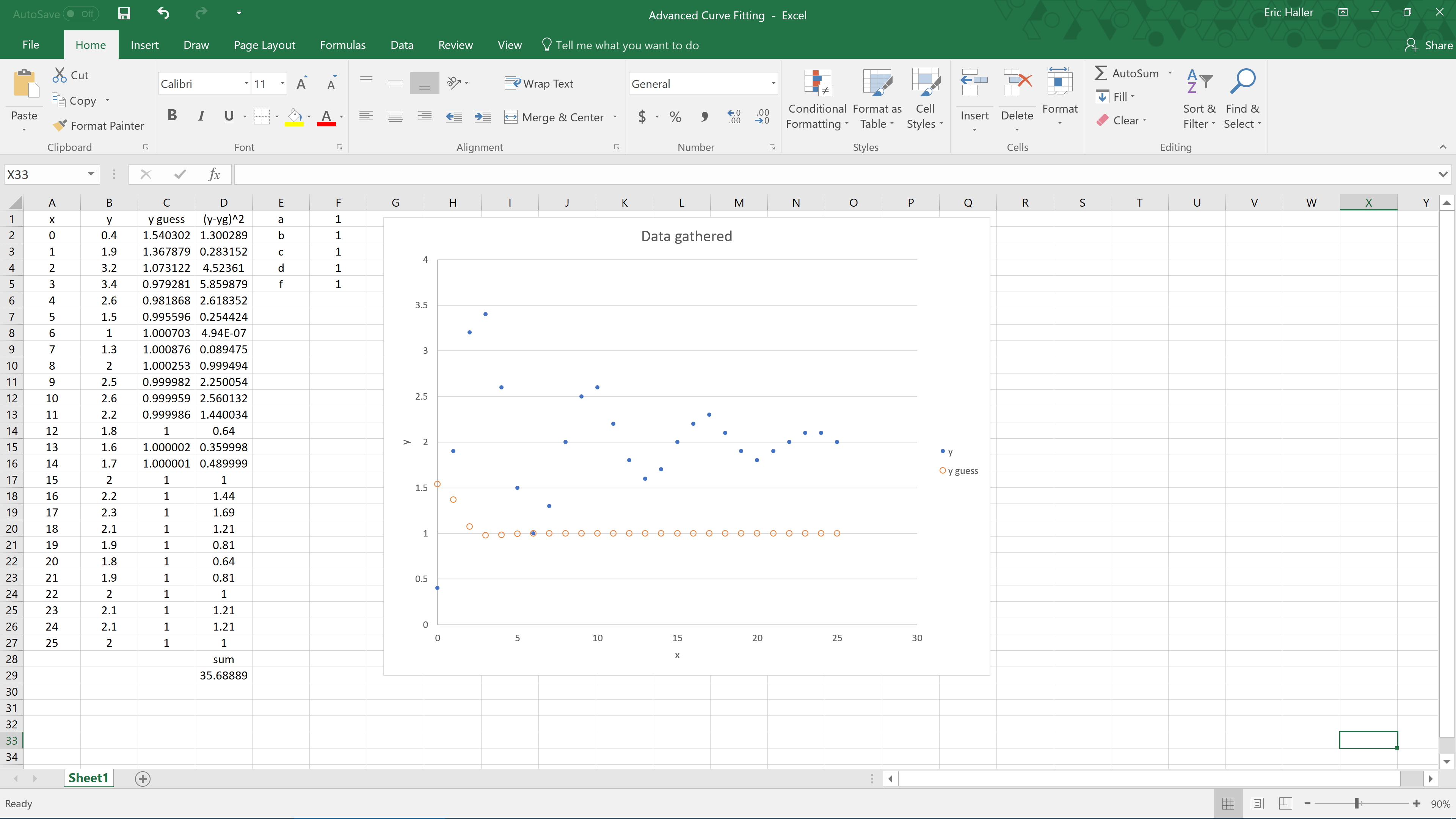
f = 1 just as a placeholder to get us started. In cell C2 write “=$F$1*EXP(-$F$2*A2)*COS($F$3*(A2-$F$4))+$F$5’. Then calculate the squares of the differences, and their sum beneath that. Create a scatter plot of
x vs.
y and
x vs.
y guess. It should look like this when you are done.
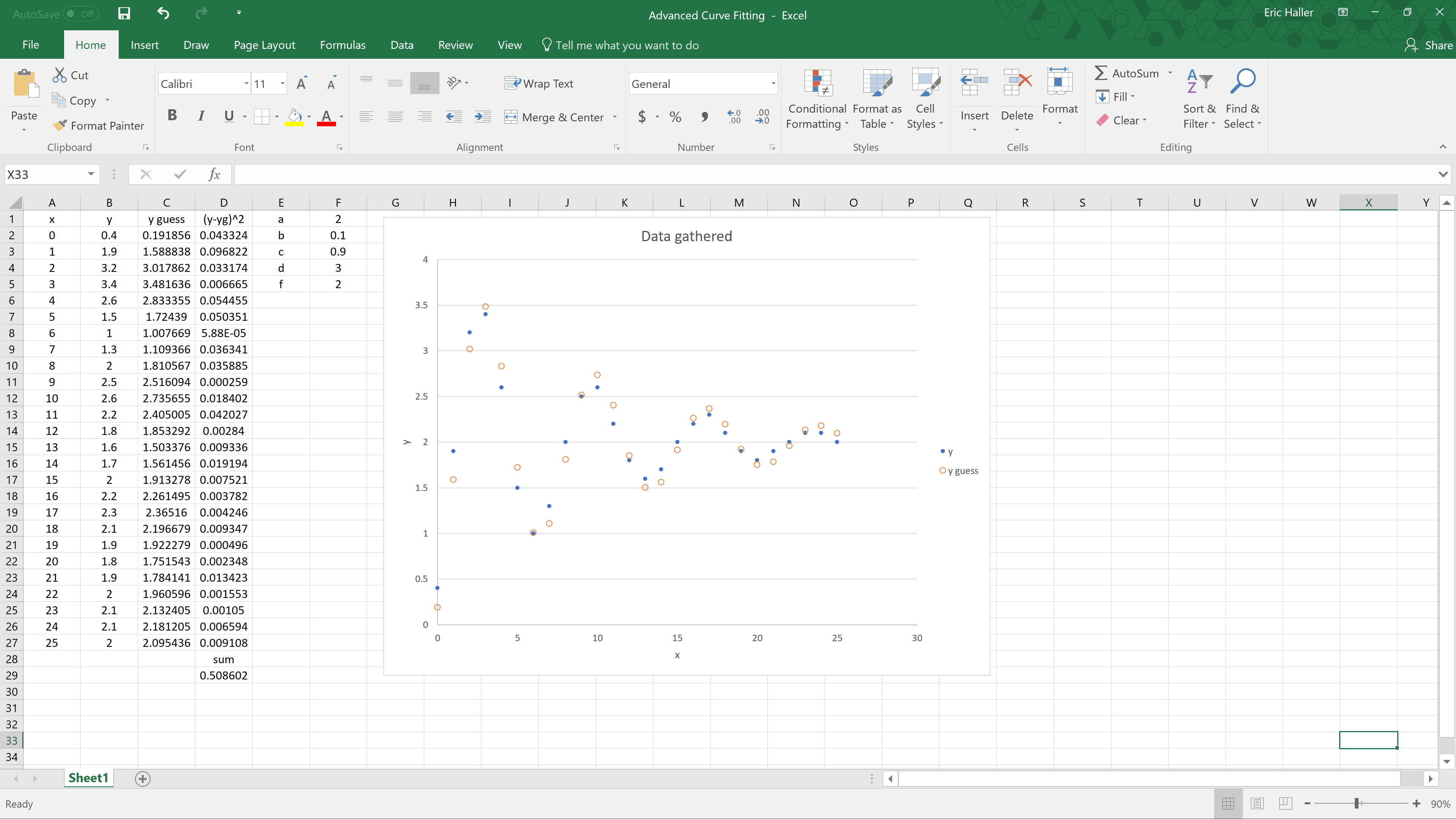
Now adjust your values for the coefficients
a,
b,
c,
d, and
f from 1 to something different, and watch how it affects the guessed plot. Keep adjusting these coefficients until the two graphs look similar, and the sum of the squares is relatively small. I adjusted the variables by eye until I settled on the values shown in the picture below.
Once you have a good guess (it is important to have a good initial guess), you can use the Solver command. Click Solver, then Set ‘Objective’ to ‘$D$29’, set ‘To’ to Min, set ‘By Changing Variable Cells’ to ‘$F$1:$F$5’, then press the Solve button. Your sum of the squares should decrease, and the variables should change slightly to the values shown in the next image.
And that’s it! Congratulations on performing a least-squares fit on a dampened harmonic oscillator.
In addition to physics courses, this kind of curve fitting can be performed in grade 12 advanced functions (MHF4U) in the combining functions section (unit D specific expectation 2). In that course I turn this into a project where my students use a camera to take a video of a swinging pendulum, use video analysis software like Logger Pro (available for a fee at
https://www.vernier.com/products/software/lp/) or Tracker (available free at
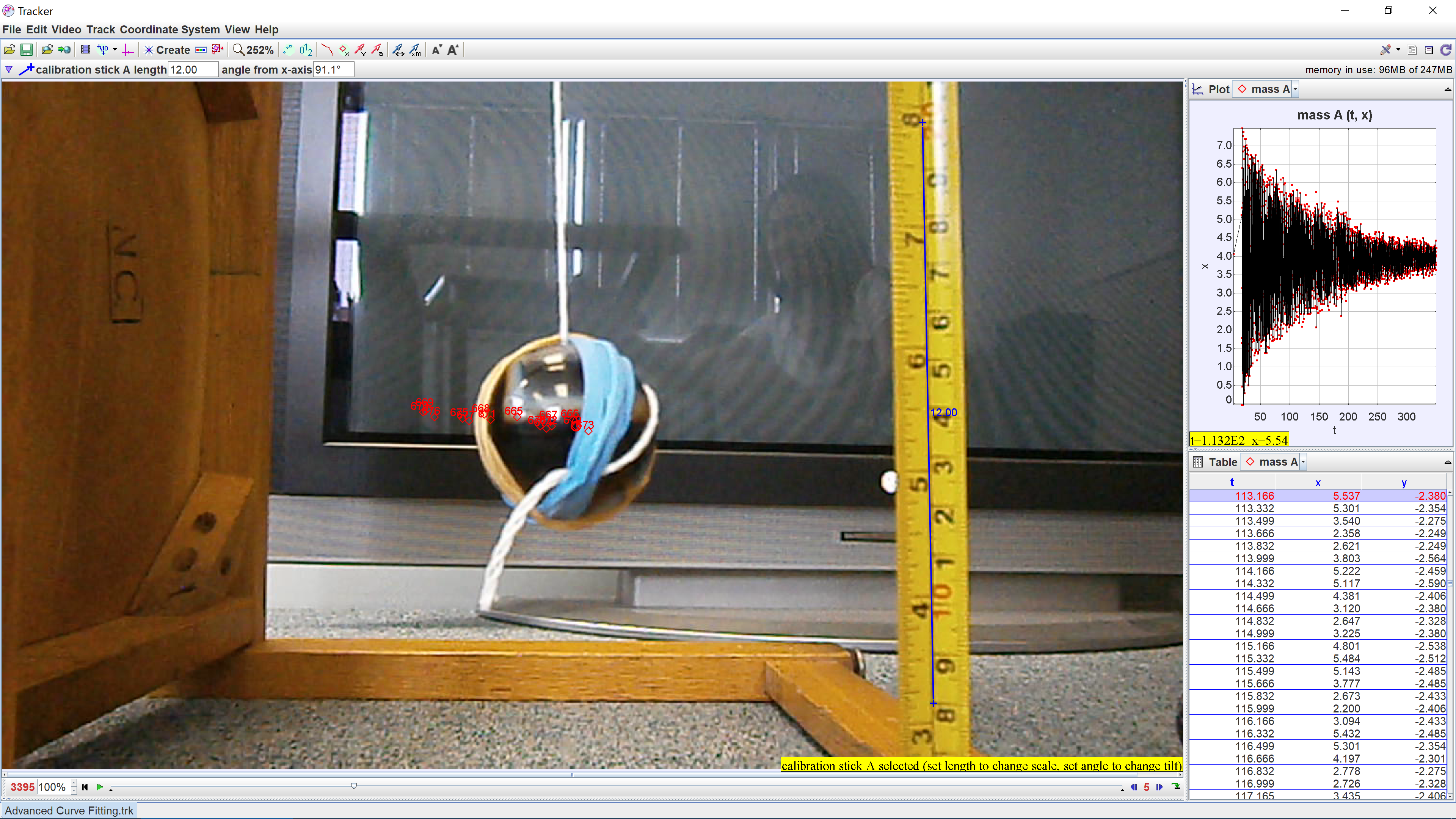
http://physlets.org/tracker/) to analyze the pendulum’s motion, and then use Excel to find an equation which describes the motion of the pendulum. The students should find that the data can be fit to a combination (specifically, the product) of an exponential function and a sinusoidal function. In case you’re not familiar with video analysis software, here’s an image of what Tracker looks like during the pendulum lab.
You can even repeat the pendulum experiment multiple times to see whether the frequency or damping coefficient changes depending on the initial displacement of the pendulum, or the length of the string.
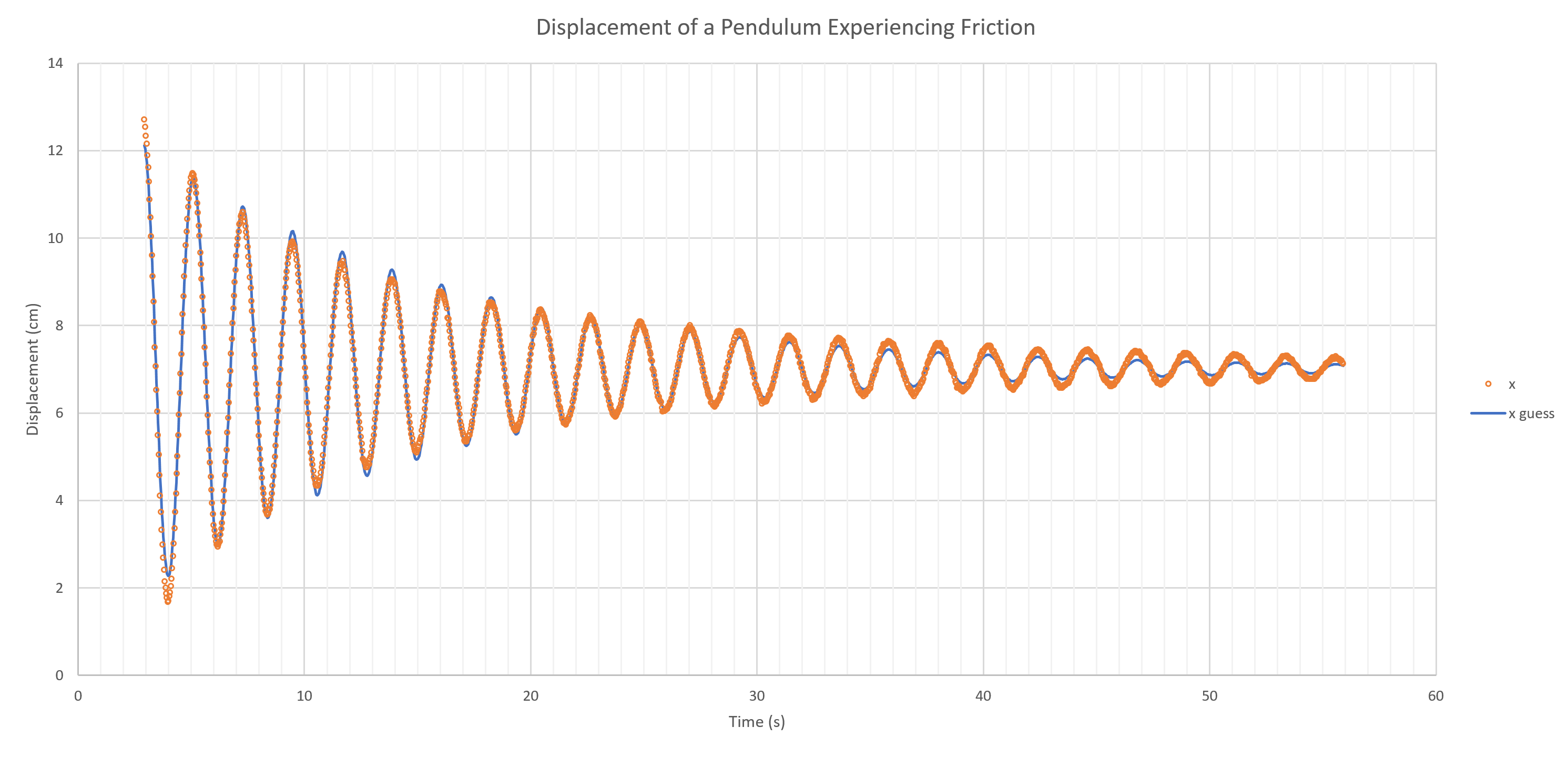
Click here to download one of the Excel worksheets that one of my students submitted. After you open the document, look at the very bottom tab. If Sheet1 is selected, you should see just the raw data. You can try to fit that data yourself if you are up to the challenge. Otherwise, on Sheet2 I’ve set it up so you just need to create a good initial guess for the variables before using Solver, which is not that difficult because the graph will adjust as you change the coefficients. Sheet3 has been fully solved and shows the optimal values for the variables. With the 1590 data points that the student had gathered, the least-squares curve of best fit came out looking very good, as you can see below.
Good luck performing least-squares fits in your classroom with your students!
Tags: Technology