Roberta Tevlin, Teacher at Danforth CTI
roberta.tevlin@tdsb.on.ca
One of the biggest problems facing the world right now is how to generate the electricity that we want without destroying the environment. This is a very complicated problem and we are supposed to help our students understand this issue in all four grades in high school: grade 9 Science (Electricity), grade 10 Science (Climate Change), grade 11 Physics (Energy and Society) and grade 12C Physics (Energy Transformations). This summer I found a great tool to help with this.
The Energy Education Website for the University of Calgary
Prof. Jason Donev and some of his students have put together a
website containing lots of dependable, up-to-date information. It links to a number of PhET simulations to help students understand some of the key physics concepts. So far, what I have found most useful on this site are two particular graphs. These graphs contain a wealth of information in a form that you can manipulate to get your students involved in deep discussions. There is a wealth of information on this site. Watch for future articles on how to use it.
For now, let’s just look at the two graphs. The
page on electricity has the following graph at the bottom.

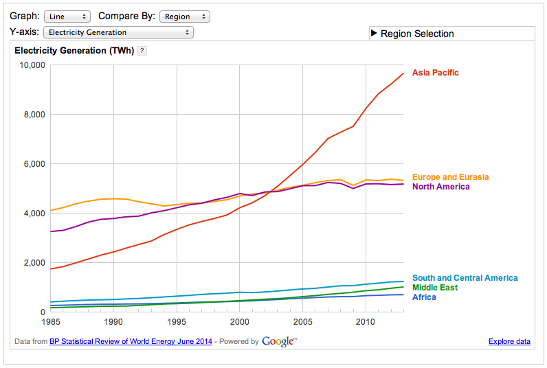
This graph contains too much information for most students to absorb without a lot of help. However, it is easy to simplify the graph and make it more involving. Select ‘Bar’ from the Graph options and then press the Play button. There is a movie below, but I recommend that you actually try it to understand what it can do.

Animated Bar Graphs: Statistics in Action!
The animated bar graph is much more interesting to watch and much easier to understand than the original line graph. I have my students observe what happened from 1985 to 2013 and ask them to write a brief description of what happened during those years. I was surprised to see that the world’s energy consumption changed very little — except for Asia which quadrupled its consumption! This huge increase is due to its population growth and its improving economic status.
Now that they have this information about the total energy consumption, I select coal and ask them to predict what they will see and why they think they will see this. After some discussion, they watch the animation. This Predict-Explain-Observe cycle is repeated for natural gas, hydro, nuclear, solar and wind.
With each graph, my grade 9 students got more and more adept at making and explaining their predictions. They also got more vehement in their discussions and more excited as each animation played. I have never had that level of excitement when dealing with graphs! They also learnt some surprising facts about what has been changing and where this has occurred.
These graphs help students understand that the problem of CO
2 emissions is a world-wide problem and it is getting more and more serious. The graphs for solar and wind generation show huge growth in the last decade and suggest that the problem has been solved. However, a quick comparison of the vertical scales reveals that ‘alternative’ energy generation is still a minor contributor. We need to make sure that we do not leave the students feeling that the problem is hopeless. An examination of a second graph on this site can be used to provide room for cautious optimism.
Generating Solutions
Next we look at a
second graph that shows how electricity is being generated world-wide.
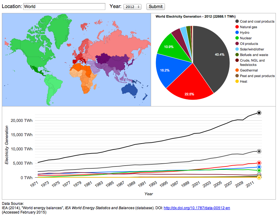

The thin blue wedge in the pie chart is for ‘solar/wind and other’. If you combine these with biofuels, waste and geothermal energy, all of these ‘alternative’ energy sources add up to only 5% of the total. Hydro (16%) and nuclear (11%) are presently the only significant sources of electrical energy that do not produce CO
2.
At this point, I give the students a challenge. Which country has the highest proportion of their electrical energy from non-CO
2 sources? From their previous work, they know that this is probably in Europe — but which country? To find the data for individual countries, you just click on the world map. It turns out that Norway has 96.7% hydro and Iceland has 70% hydro and 30% geothermal. These two countries are very fortunate in their geography and have found solutions that are not available to most countries.
Therefore a more useful question is which country has the highest amount of non-CO
2 energy production — excluding hydro and geothermal. The winner is France, with 74% nuclear and 5% alternative. A close second is Belgium with 49% nuclear and 14% alternative.
None of these countries has increased its nuclear generation in the past two decades. How much energy can you get from the ‘alternative’ sources; wind, solar, biofuels and waste? Which country has the highest amount of electrical generation from these sources? The winning country is Denmark which has 34% coming from solar/wind and 17% from biofuels/waste for a total of 51% from ‘alternative’ energy sources. What is particularly stunning is that ten years ago, this number was only 7.5%! This country’s switch to ‘green’ energy production is less a result of geographical luck and more due to political will. It can serve as an inspiration to other countries.
I have attached two files. One is the
student worksheet for this lesson; the other is the
teacher’s version containing the answers and a lot more information for teachers in red. At the end of this lesson, I think students have a better understanding that the solution to generating electricity will require scientific understanding, technological developments, political will-power and a well-educated society.
Tags: Electricity, Energy