Write Like Einstein: A Review of Harold Geisler’s Einstein Font
November 24, 2021 Filed in:
ReviewRobert Prior, ePublisher of OAPT Newsletter
science@robertprior.caHave you ever wished you could write like a great scientist? Now you can, with Harald Geisler’s Einstein font. It won’t give you Einstein’s brains or his cool hair, but at least you can have his handwriting.
There are many fonts* on the market, including some good handwriting fonts, but few are as well-designed as Harald Geisler’s. He starts by carefully examining many examples of a person’s writing, looking at how they form the letters as well as how their letters vary.
The Albert Einstein font is collaboration between a typographer and a dancer: Harald Geisler, graduate of the University of Art and Design Offenbach in Germany, and Liz Waterhouse, BA Physics from Harvard and former dancer with the Forsythe Company in Frankfurt.
The collaboration began in 2009, over a series of coffees in Frankfurt. Liz remembers looking at a text written in a handwriting font (on her napkin at the coffee shop) and asking Harald if he could design one. The idea to make a “life-like” handwriting font from studying penmanship of innovative thinkers came next.
The choice to start with Albert Einstein’s handwriting was aesthetic and pragmatic, even a bit nostalgic given Liz’s memories of reading Einstein's nonscientific essays as a teenager. Perhaps it should come as no surprise that Einstein had beautiful handwriting. “Einstein's equations were beautiful, so it makes sense that their presentation should be as well!" says Astrophysicist Phil Marshall (at SLAC Stanford). Einstein’s handwriting reflected movement with clear rhythm, even flow, and soft curves. Harald's task was to develop a font that preserved that feel.
After six months studying examples of Einstein’s handwriting from documents in the Albert Einstein Archives, Harald created a working prototype. Working with a digital pen to follow the rhythm of Einstein’s movement on paper, Geisler’s result had a pleasing and strong resemblance to Einstein’s actual handwriting.
In 2014 the Einstein Estate accepted the proposal for an Albert Einstein font.
Unlike most handwriting fonts, which only have one version of each letter, Geisler’s Einstein font has many versions of each letter and dynamically changes between them as you type, so the words really do look handwritten. The font has five samples for each lower and uppercase letter, number and punctuation mark, based on original manuscripts by Albert Einstein. The font is programmed to constantly shift characters between these sets as you type, which ensures that the text looks realistic and guarantees that the same two letters are never repeated next to each other.
Is this of any practical use in a physics class? Honestly, I can’t think of one — but it’s cool, and once in a while we need cool things just because :-)
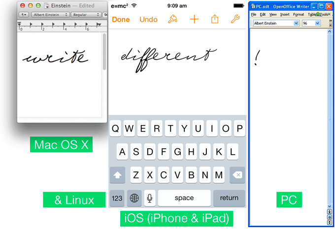
I backed this project on Kickstarter, but you can now purchase it directly from the designer at
https://haraldgeisler.com. As of writing, it costs 55 €, and is available for Mac, PC, iOS and Linux. Geisler has also designed fonts based on the handwriting of Sigmund Freud and Martin Luther, and he is currently working on one for Martin Luther King Jr.
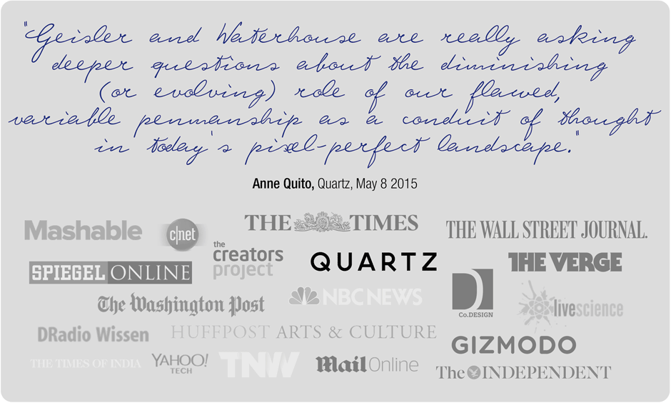
Note: images and quotation from the Kickstarter campaign.
*Technically a font is italics etc., while a typeface is Helvetica etc. But ever since the original Mac used the wrong word, non-professionals have also been using the wrong word, so this article will use “font” for typeface and “style” for font.
Tags: History